
Customizing dashboards
ChartMogul's dashboard customization lets you modify the layout and content of any personal or shared dashboard.
Customize the dashboards by adding, rearranging, editing, and removing reports so that each team has easy access to their most important charts, lists, and metrics. Or, create your own dashboards.
You’ll need to be a Staff, Admin, or Owner in ChartMogul to customize personal and shared dashboards. Read-only and CRM-only team members can only customize their personal dashboards.
Here’s what we cover in this article:
- Adding reports to a dashboard
- Rearranging reports on a dashboard
- Editing dashboard reports
- Removing reports from a dashboard
- Moving reports between dashboards
- Available dashboard reports
Adding reports to a dashboard
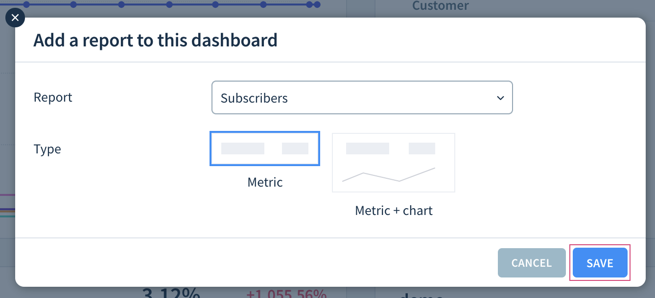
To add a report to a dashboard:
- Switch to the dashboard you want to customize.
- Click the Settings icon and select Add report to this dashboard.

- Select the Report you want to add:
- Default Charts: One of ChartMogul’s default reports
- Saved Charts: A saved chart shared with the team
- Saved Charts (Just me): A personal saved chart
- Saved Customer Lists: A saved customer list shared with the team
- Saved Customer Lists (Just me): A personal saved customer list
- Saved Opportunity Lists: A saved opportunity list shared with the team
- Saved Opportunity Lists (Just me): A personal saved opportunity list
- Configure additional options depending on the report type.
-
Click SAVE, and the report will be added to the dashboard.

Additional options
When adding a report to a dashboard, configure additional settings depending on the report type:
- Common charts
- Activity Overview
- Forecast Category Report and Sales Leaderboard
- MRR/ARR Breakdown
- Pipeline Created and Value of Won Opportunities
- Saved customer and opportunity lists
- Target
- Won Opportunities Target
Common charts
Specify the Type: either the current value (Metric) or a mini-graph (Metric + chart).
If you’ve selected Metric + chart:
- Define the Date range for chart. Set a number of Previous days, weeks, months, etc., or a Fixed start date.
- Choose the Chart intervals (Days, Weeks, Months, Quarters or Years).
- Under Visualization, choose Line or Bar.

Activity Overview
Select up to four types of Activities to show:
- Emails sent
- Calls
- Opportunities added
- Tasks completed
- Notes
Forecast Category Report and Sales Leaderboard
Under Pipeline, select one or more sales pipelines or All pipelines.
MRR/ARR Breakdown
Under Default to, choose whether the report should initially display MRR or ARR movements.
Pipeline Created and Value of Won Opportunities
- Under Pipeline, select one or more sales pipelines or All pipelines.
- Define the Date range for chart. Set a number of Previous days, weeks, months, etc., or a Fixed start date.
- Choose the Chart intervals (Months or Quarters).
Saved customer and opportunity lists
Select the number of columns to show (2–4). The order and sorting of columns will be the same as in your saved list.
Target
- Select the Metric for your target (MRR, ARR, or Paid Subscribers).
- Select a Target Interval (Monthly, Quarterly, or Yearly).
- Enter the revenue or subscriber count you want to achieve in the period.
Won Opportunities Target
- Under Pipeline, select one or more sales pipelines or All pipelines.
- Enter the Target amount.
Rearranging reports on a dashboard
To rearrange the reports on a dashboard:
- Switch to the dashboard you want to customize.
- Hover over the report to reveal the drag handle in the top-left corner. Click and drag the handle to move the report.

Editing dashboard reports
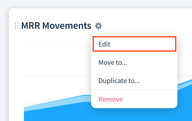
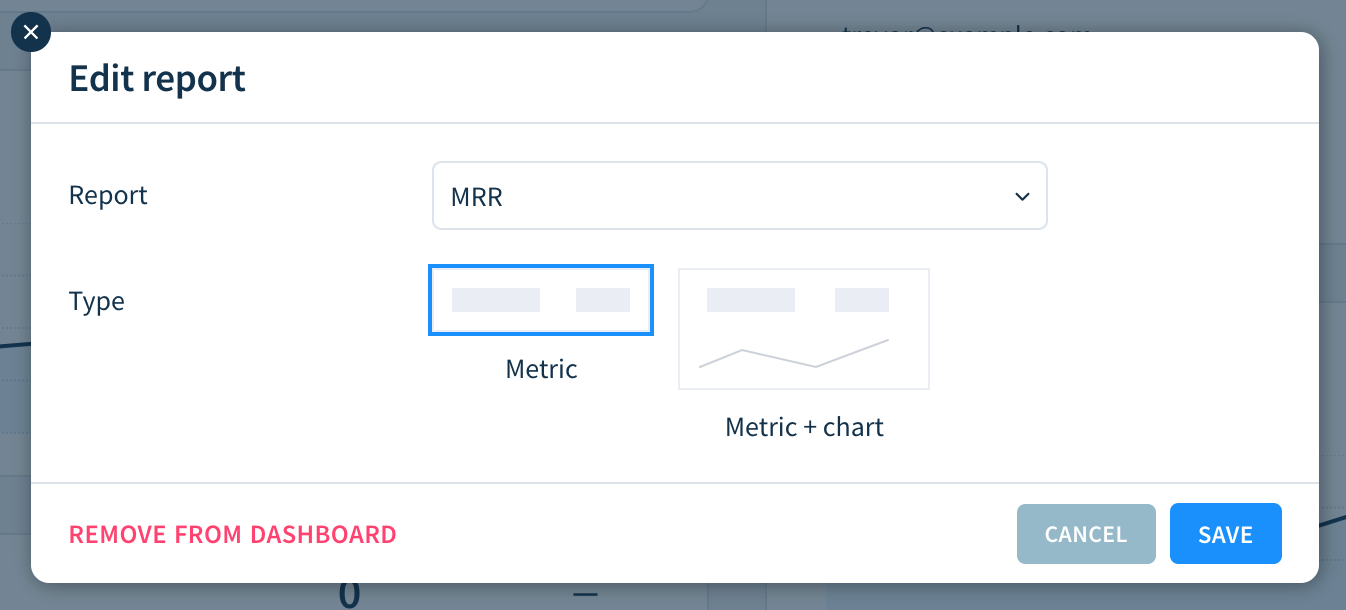
To edit an existing report:
- Switch to the dashboard that contains the report.
-
Hover over the report’s name, click the Settings icon, and select Edit.
-
Adjust any settings and click SAVE.


Removing reports from a dashboard
To remove a report from a dashboard:
- Switch to the dashboard you want to customize.
- Hover over the report’s name, click the Settings icon, and select Remove.
- Confirm by clicking OK.
Moving reports between dashboards
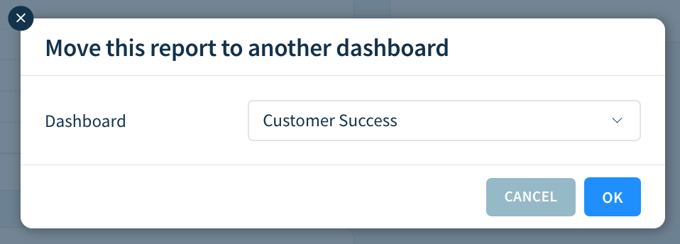
To move a report to another dashboard while removing it from the current dashboard:
- Switch to the dashboard you want to customize.
- Hover over the report’s name, click the Settings icon, and select Move to…
-
Select a Dashboard where you want to move the report and confirm by clicking OK.

To copy a report to another dashboard while keeping it on the current dashboard:
- Switch to the dashboard you want to customize.
- Hover over the report’s name, click the Settings icon, and select Duplicate to…
- Select a Dashboard where you want to copy the report and confirm by clicking OK.
Available dashboard reports
Here’s a list of default reports you can display on your dashboards.
Subscription Analytics reports
These reports are available with Subscription Analytics.
| Report name | Description |
|---|---|
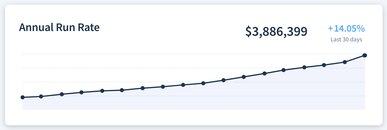
| Annual Run Rate |
The current Annual Run Rate, its percentage change in the last 30 days, and optionally, a bar or line chart showing changes over time.
|
| Average Customer Lifespan | The current Average Customer Lifespan, its percentage change in the last 30 days, and optionally, a bar or line chart showing changes over time. |
| Average Order Value | The current Average Order Value, its percentage change in the last 30 days, and optionally, a bar or line chart showing changes over time. |
| Average Revenue Per Account | The current Average Revenue Per Account, its percentage change in the last 30 days, and optionally, a bar or line chart showing changes over time. |
| Average Sale Price | The current Average Sale Price, its percentage change in the last 30 days, and optionally, a bar or line chart showing changes over time. |
| Average Sales Cycle Length | The current Average Sales Cycle Length, its percentage change in the last 30 days, and optionally, a bar or line chart showing changes over time. |
| Average Spend Per Customer | The current Average Spend Per Customer, its percentage change in the last 30 days, and optionally, a bar or line chart showing changes over time. |
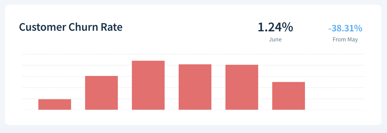
| Customer Churn Rate |
The current Customer Churn Rate, its percentage change in the last 30 days, and optionally, a bar or line chart showing changes over time.
|
| Customer Lifetime Value | The current Customer Lifetime Value, its percentage change in the last 30 days, and optionally, a bar or line chart showing changes over time. |
| Failed Transactions | The current number of Failed Transactions, its percentage change in the last 30 days, and optionally, a bar or line chart showing changes over time. |
| Free Trials | The current number of Free Trials, its percentage change in the last 30 days, and optionally, a bar or line chart showing changes over time. |
| Gross Cash Flow | The current Gross Cash Flow, its percentage change in the last 30 days, and optionally, a bar or line chart showing changes over time. |
| Gross MRR Churn Rate | The current Gross MRR Churn Rate, its percentage change in the last 30 days, and optionally, a bar or line chart showing changes over time. |
| Gross MRR Retention | A bar or line chart showing Gross MRR Retention over time. |
| Leads | The current number of Leads, its percentage change in the last 30 days, and optionally, a bar or line chart showing changes over time. |
| MRR |
The current Monthly Recurring Revenue, its percentage change in the last 30 days, and optionally, a bar or line chart showing changes over time.
|
| MRR/ARR Breakdown |
The number and value of MRR or ARR movements (New Business, Expansion, Contraction, Churn, and Reactivation) as well as the net movement and scheduled MRR movements in a given period. Use the drop-downs to switch between MRR and ARR movements and to change the period (e.g., THIS MONTH or LAST WEEK).
|
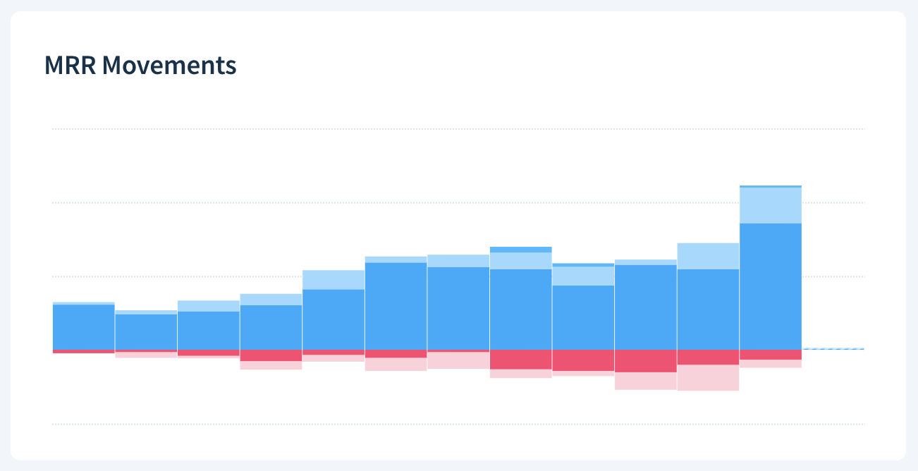
| MRR Movements |
A bar or line chart showing MRR Movements over time.
|
| Net Cash Flow | The current Net Cash Flow, its percentage change in the last 30 days, and optionally, a bar or line chart showing changes over time. |
| Net MRR Churn Rate | The current Net MRR Churn Rate, its percentage change in the last 30 days, and optionally, a bar or line chart showing changes over time. |
| Net MRR Retention | A bar or line chart showing Net MRR Retention over time. |
| Non-Recurring Cash Flow | The current Non-Recurring Cash Flow, its percentage change in the last 30 days, and optionally, a bar or line chart showing changes over time. |
| Non-Subscription Customers | The current Non-Subscription Customers, its percentage change in the last 30 days, and optionally, a bar or line chart showing changes over time. |
| Paid Subscriber Growth Rate | The current Paid Subscriber Growth Rate, its percentage change in the last 30 days, and optionally, a bar or line chart showing changes over time. |
| Paid Subscriber Retention Rate | The current Paid Subscriber Retention Rate, its percentage change in the last 30 days, and optionally, a bar or line chart showing changes over time. |
| Paid Subscription Growth Rate | The current Paid Subscription Growth Rate, its percentage change in the last 30 days, and optionally, a bar or line chart showing changes over time. |
| Quantity Churn Rate | The current Quantity Churn Rate, its percentage change in the last 30 days, and optionally, a bar or line chart showing changes over time. |
| Recurring Revenue Growth Rate | The current Recurring Revenue Growth Rate, its percentage change in the last 30 days, and optionally, a bar or line chart showing changes over time. |
| Refunds | The current amount of Refunds, its percentage change in the last 30 days, and optionally, a bar or line chart showing changes over time. |
| Subscriber Movements | A bar or line chart showing Subscriber Movements over time. |
| Subscribers | The current number of Subscribers, its percentage change in the last 30 days, and optionally, a bar or line chart showing changes over time. |
| Subscription Movements | A bar or line chart showing Subscription Movements over time. |
| Subscription Quantity | The current Subscription Quantity, its percentage change in the last 30 days, and optionally, a bar or line chart showing changes over time. |
| Subscriptions | The current number of Subscriptions, its percentage change in the last 30 days, and optionally, a bar or line chart showing changes over time. |
| Successful Payments | The current number of Successful Payments, its percentage change in the last 30 days and optionally, a bar or line chart showing changes over time. |
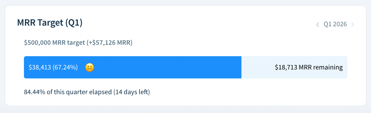
| Target |
The quarterly, monthly or yearly target you’ve set for a selected metric (MRR, ARR, Paid Subscribers, or Net Cash Flow), a progress bar showing how much of the goal you’ve achieved and the time remaining in the period. Click < and > to switch between periods.
|
| Trial-to-Paid Conversion Rate | The current Trial-to-Paid Conversion Rate, its percentage change in the last 30 days, and optionally, a bar or line chart showing changes over time. |


CRM reports
These reports are available with ChartMogul CRM.
| Report name | Description |
|---|---|
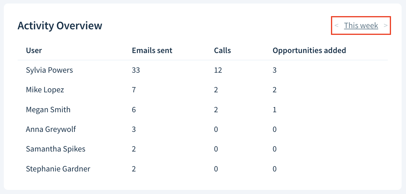
| Activity Overview |
The number of activities performed by each team member in a given week. When adding the report to a dashboard, choose up to four activity types: emails sent, calls, opportunities added, tasks completed and notes. Click < and > to switch between weeks.
|
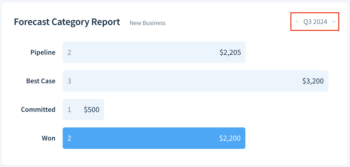
| Forecast Category Report |
Forecast Category Report (an overview of new MRR in each forecast category) for a selected pipeline in a given quarter. Click < and > to switch between quarters.
|
| My Tasks |
A list of up to seven open tasks assigned to the currently logged-in team member, sorted by due date (most urgent first). Click the round checkbox to mark a task as completed.
|
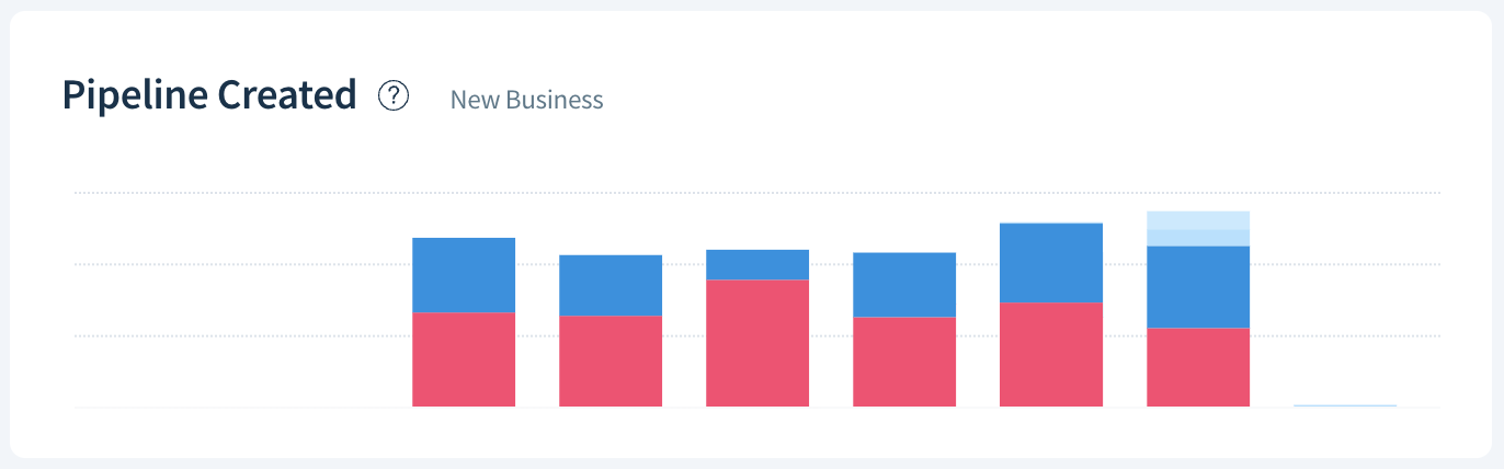
| Pipeline Created |
A bar chart showing the total number of opportunities created in a given time interval by value and current stage. Analyze pipeline created over time to understand how well your team generates new opportunities.
|
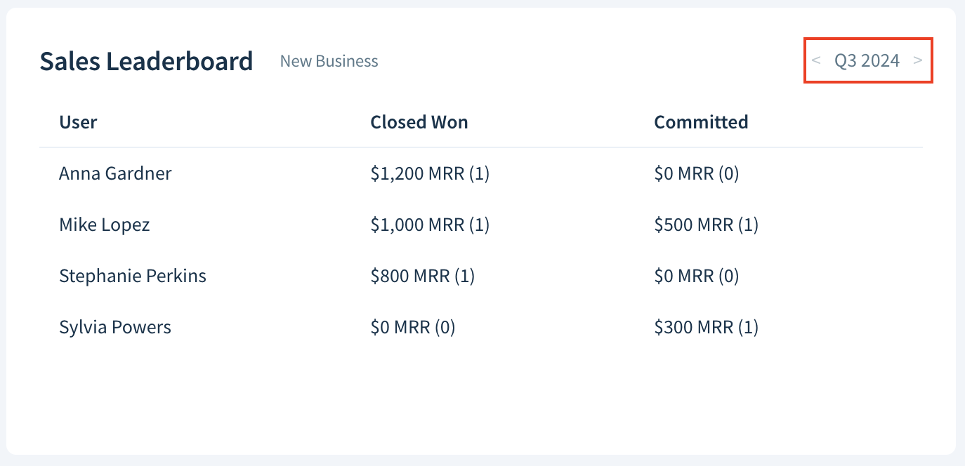
| Sales Leaderboard |
A ranking of salespeople with the highest value of won and committed deals in a selected pipeline in a given quarter. Click < and > to switch between quarters.
|
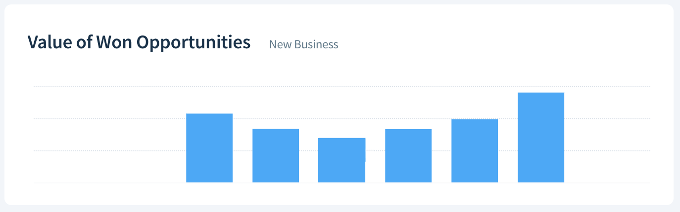
| Value of Won Opportunities |
A bar chart showing the total value of opportunities won in a given time interval for all pipelines or a selected pipeline.
|
| Won Opportunities Target |
The quarterly sales target you’ve set for all or selected pipelines, a progress bar showing how much of the goal you’ve achieved, and time left in a quarter. Click < and > to switch between quarters.
|


Next Steps
- Learn how to create, edit, and delete dashboards.
- Fix any imperfections in your subscription metrics with ChartMogul’s data cleaning features such as merging customers and MRR data editing.
- Import lead and trial data into ChartMogul.