
Getting started with charts in ChartMogul
Charts are the reporting interface for visualizing and analyzing key subscription metrics such as Monthly Recurring Revenue (MRR), Paid Subscriber Churn Rate, Customer Lifetime Value (LTV), and Average Revenue Per Account (ARPA).
Each chart consists of an interactive graph, summary metrics showing changes at 30-, 60-, 180-, and 365-day intervals, and a Chart Data table that breaks down your metric by MRR movement type for the selected reporting period.
This article explains how to configure a chart's reporting period, graph type, filters, and segments; how to save, share, and download charts; and how to use Chart Data to drill into the subscription activities behind each data point.
Here’s what we cover in this article:
Resources and further reading:
Overview

The date range drop-down (1) allows you to pick the start and end dates for your chart (i.e., establish the reporting period). The Toolbar (2) provides various options for configuring your chart (e.g., switching the chart type from line to bar or zeroing the Y-axis). The Graph (3) is the visual representation of your metric (e.g., Monthly Recurring Revenue (MRR)), while the Summary Metrics (4) that follow show how your metric has changed at key intervals over the past year. Finally, the Chart Data table (5) contains a breakdown of the data for the reporting period.
Configuring the chart
Setting the reporting period

Pick a start and end date using the date range drop-down or select from one of the presets available: Last 30 Days, Last 90 Days, Last 365 Days, YTD (year-to-date) or All (data available).
Changing the graph type

Select the type of graph you would like to see, either LINE or BAR.
Zeroing the Y-axis
By default, ChartMogul chooses a range for the Y-axis that best visualizes the metric for the reporting period you’ve selected. Click the Zero Y-axis to have ChartMogul plot the metric relative to zero.

Showing labels
Click the Show Labels icon to show numerical values on the plot.

Comparing segments
Click the Compare Segments icon to display all segments at the same time or one selected segment. This switch only becomes active after you have added at least two segments to the chart.

Stacking segments
Use the Stack and 100% Stack icons to display segments on a stacked chart. Learn more.

Adding a filter

Filters allow you to focus your analysis on a subset of your subscription data, for example, looking at MRR growth for an individual plan. They’re easy to use:
- Click ADD A FILTER.
- Select an attribute.
- Choose an operator.
- Enter or select an appropriate value for the filter, then click ADD.
To remove a filter, click the filter you previously added, then click REMOVE FILTER.
Learn more about working with filters in ChartMogul.
Segmenting
Segmentation helps you gain deeper insights into your data. Check out our in-depth guide on segmentation, including how to create, compare and stack segments.
Showing and hiding segments

Segments are hidden by default. Click the Show segments (eye) button to reveal any applied segments. Once shown, segments stay visible everywhere in the app until you click the button again to hide them.
Selecting an interval

Select the major X-axis interval for the graph. Depending on the chart you’re working with, you can select between DAY, WEEK, MONTH, QUARTER and YEAR. A smaller, more frequent interval (e.g., day) increases the resolution of (the number of data points plotted on) the graph.
The measurement interval is used in conjunction with the reporting period to establish the chart’s report intervals.
Setting comparison periods
Select charts allow you to toggle between the default and year-over-year views.

Available options depend on the selected interval:
- DoD (day-over-day) or YoY (year-over-year) for DAY
- WoW (week-over-week) or YoY (year-over-year) for WEEK
- MoM (month-over-month) or YoY for MONTH
- QoQ (quarter-over-quarter) or YoY for QUARTER
Chart Data values reflect the selected view.

Switching between MRR and ARR
Select charts allow you to toggle between viewing your metric as MRR (Monthly Recurring Revenue) or ARR (Annual Run Rate). Chart Data values reflect the selected view.

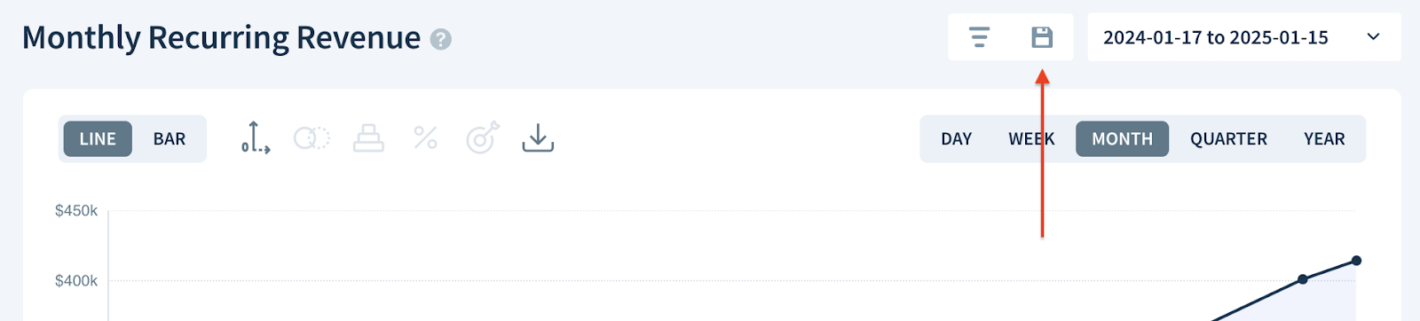
Saving the chart
It is not possible to save charts on a free plan.
Organize your saved charts into folders or add them to dashboards.
Watch a video about saving charts:
Save a version of your chart for future reference or share it with your team:
-
Click the Save this chart button.
- Enter a name for your chart in the Name field. We recommend including the metric’s name and a brief description of the filter or segment you’ve used (if any) so it’s clear what you’re measuring and analyzing.
- Select who should see your chart: Just me, Team members with a CRM Pro seat or Entire team.
- Choose a time period for your chart:
- Previous — Enter a number of days to be included in your chart (e.g., last 365 days).
- Fixed date range — Select a fixed date range to be included in your chart (e.g., January 1, 2024 – December 31, 2024).
- Fixed start date — Select a fixed start date for your chart (e.g., January 1, 2025). The end date will be the current date.
- Finally, click SAVE.


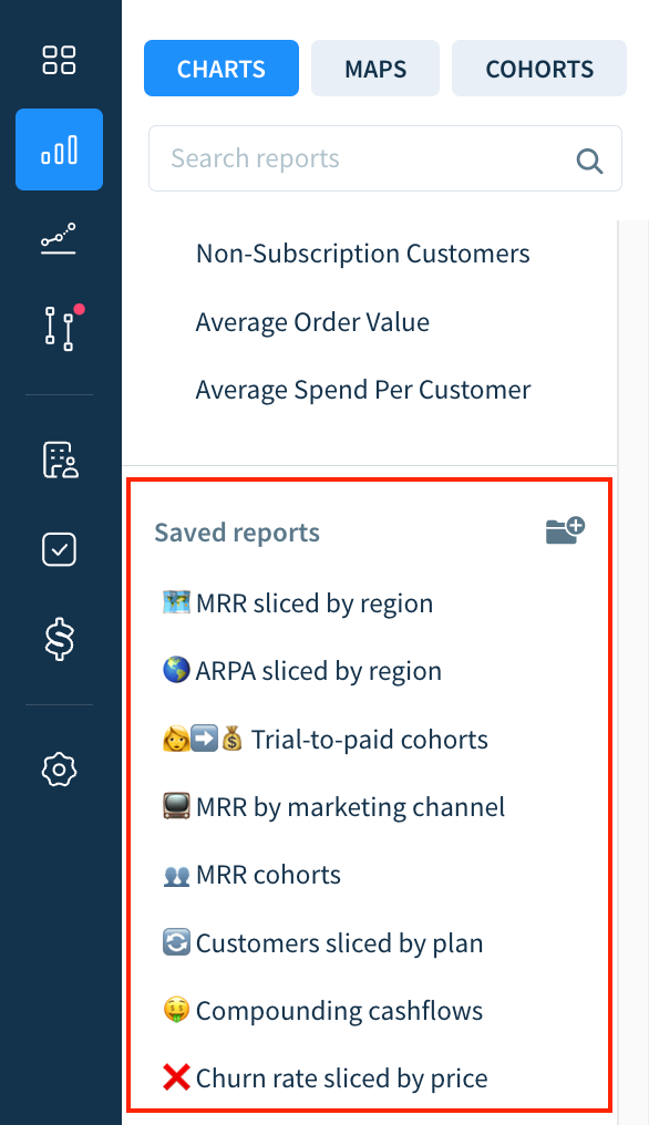
Access your saved charts along with some of our favorites (which we’ve pre-loaded into your account) under Saved reports in the Charts sidebar. Re-order saved charts by dragging and dropping them. Update the configuration of (or delete) a saved chart by clicking the Settings icon.
Downloading an image

Share your success with your team or social media by downloading an image of the chart.
- Click the :image~gray: Download Image icon.
- Choose a background image from the options available.
- Include the Y-axis in the image by selecting Show y-axis.
- Display the name of the chart above the graph by clicking Show title.
- Highlight the most recent metric value by choosing Show tooltip.
- Enter a title for the image in the Header field.
- Finally, click COPY (to clipboard) or DOWNLOAD (as a PNG file).
Learn about other ways to export your data from ChartMogul.
Working with the chart
There are three main information components to charts in ChartMogul: graph, summary metrics and data table.
Graph

The graph ChartMogul presents is based on your date range and chart options (e.g., graph type, zero Y-axis, etc.). The graph is interactive — select a point along the line (or a bar) to see your metric on that date and its percent increase (or decrease) from the previous metric value. ChartMogul also highlights the corresponding column of data in Chart Data.
Incomplete and future report intervals appear as a dotted line (or striped bars). To estimate the value for an ongoing interval, ChartMogul takes into account the number of days that have already passed in the interval and the total number of days in the interval. This is the value you’re projected to achieve at the end of the interval provided that all values used to calculate the metric remain constant.

Summary Metrics

Summary metrics show how the metric has changed (increased or decreased) at key intervals in the past year: 30, 60, 180 and 365 days ago.
Chart Data

ChartMogul creates MRR movements for subscription events that change a subscription’s plan, quantity, or pricing. For most charts, Chart Data provides a breakdown of your metric by MRR movement type. ChartMogul lists the total MRR (1) and the number of customers associated with each movement type (2) for each report interval. Learn more about Chart Data.
Click a cell in the table to display a breakdown of the subscription activities that contributed to that movement. Customize which columns appear in the breakdown using the Configure table columns button (three vertical bars). Learn more.
Next Steps
Review charts available in your account and check out the Analyzing Reports section of our help center for articles on specific charts in ChartMogul.
If you’re new to SaaS metrics, we recommend getting familiar with these charts:
- MRR Movements — one of the classic and most iconic SaaS charts, MRR movements breaks down your growth into the six MRR movement types to give you a clearer understanding of where you’re gaining (and losing) revenue with new and existing subscribers.
- Average Revenue per Account — track the performance of your pricing and sales strategies by analyzing which segment(s) (e.g., region, plan or industry) has the highest value subscribers.
- Customer Churn Rate — managing churn is central to the success of every SaaS business. Customer Churn Rate lets you see (and therefore manage) the rate you’re losing subscribers due to cancellation.
Also, check out our SaaS Metrics Cheat Sheet and review our SaaS metrics library.