
Chart: MRR Movements
The MRR Movements chart shows how your Monthly Recurring Revenue has developed over time, breaking it down by movement type — New Business, Expansion, Reactivation, Contraction, and Churn.
For SaaS businesses, it's an essential diagnostic tool: rather than just showing a single MRR number, it reveals exactly where revenue is being gained and lost each period, making it easier to identify what's driving growth or holding it back.
If you're new to ChartMogul, get to know how charts work.
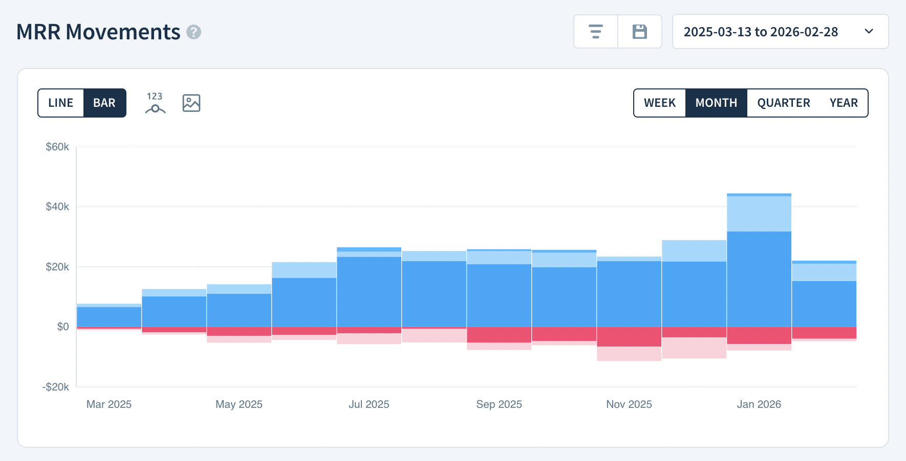
Chart Notes
- Each vertically-stacked band represents a specific MRR movement type. New Business, Expansion and Reactivation are blue. Contraction and Churn are pink. Blue represents MRR growth and appears above $0. Pink represents the loss of MRR and appears below $0. MRR grew in a period when the combined height of the blue bands is greater than the pink.
- Diagonally-striped bars include the current period (today) and, thus, are an estimate until the period is over.
Calculation
ChartMogul totals the value of all MRR movements contributing to each movement type in the period.
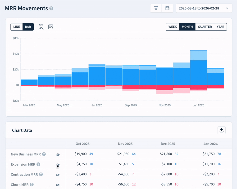
Isolating movements
Click the eye icon in the Chart Data table to configure the individual MRR movements visible in the chart. For example, create a chart showing only New Business, Expansion and Reactivation:
Click the Save this chart button to create a saved version of the modified chart.
Chart Data
Click a cell in the Chart Data table to view the subscription activities for a movement. Click a Net MRR Movement cell to view all movements in a period.
Learn more about Chart Data.
Next Steps
- Learn more about MRR Movements.
- Read our blog on Understanding and Benchmarking Your MRR Movements.
- Improve the accuracy of MRR Movements with reclassification of subscription activity.