
Report: Subscriber Movements
The Subscriber Movements report shows how many paying subscribers your business gains and loses each period — split into new, reactivated, and churned subscribers.
Tracking these movements individually (not just the net total) helps you spot retention problems early and understand what's driving growth.
If you’re new to ChartMogul, get to know how reports work.
How to Read the Report
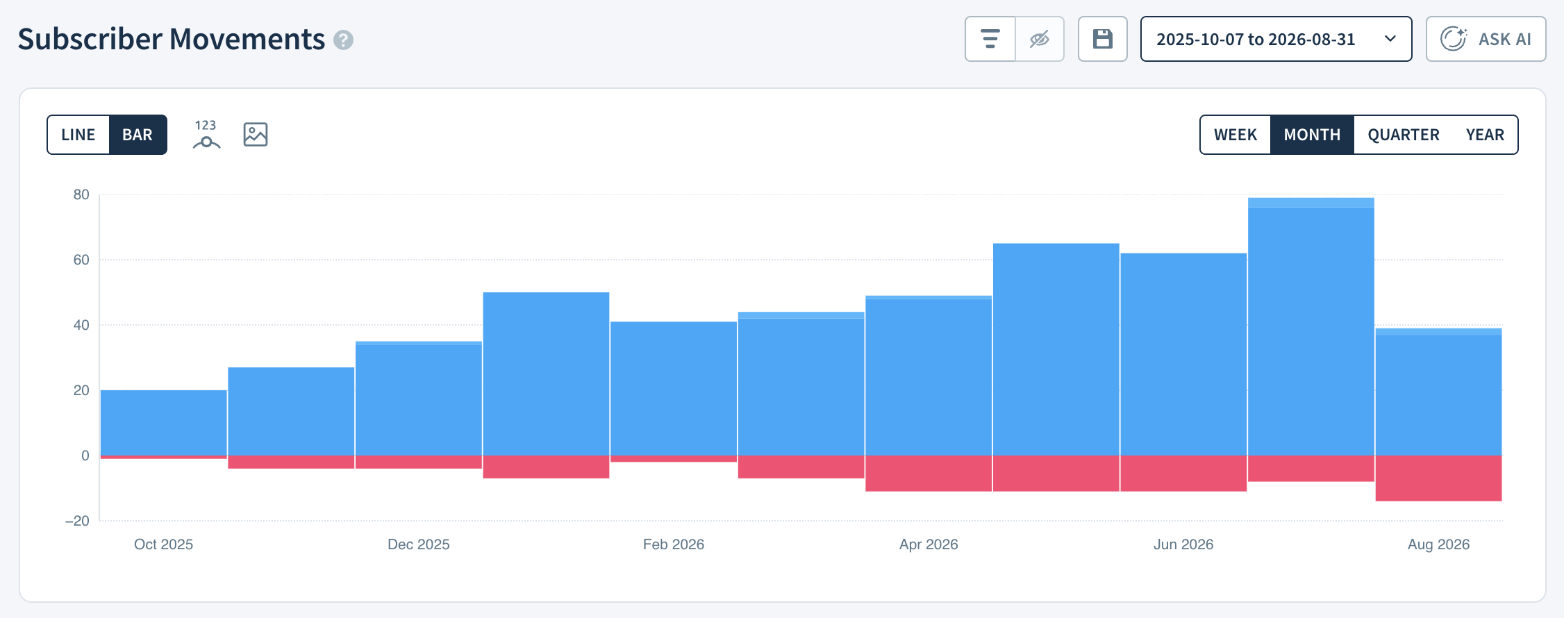
- Each vertically stacked band represents a specific subscriber movement type. New Subscribers are dark blue, Reactivated Subscribers are light blue, and Churned Subscribers are pink.
- The Subscribed & Churned category includes customers who start their first and cancel their last paid subscription within a given report interval.
How ChartMogul Calculates Subscriber Movements
ChartMogul counts the number of subscribers who start, reactivate, or cancel their paid subscriptions in the period. A subscriber is a customer with at least one active paid subscription. Customers with multiple subscriptions are only counted once.
How to Isolate Individual Movements
In the Report Data table, click the :font-invisible~gray: eye icon next to any movement type to show or hide it in the report.

Click the Save this report button to create a saved version of the modified report.
Report Data
The Report Data table for Subscriber Movements includes these metrics:
- New Subscribers — The number of subscribers who start their first paid subscription in the report interval.
- Reactivated Subscribers — The number of subscribers who renew a previously cancelled paid subscription in the report interval.
- Churned Subscribers — The number of subscribers who cancel their last paid subscription in the report interval.
- Subscribed & Churned — The number of customers who start their first and cancel their last paid subscription within the report interval.
- Net Subscriber Movement — The net gain or loss of paying subscribers in the report interval.
- Subscribers Entering Segment — When filtering by plan, the number of subscribers entering the applied segment within the report interval.
- Subscribers Leaving Segment — When filtering by plan, the number of subscribers leaving the applied segment within the report interval.
- Change — The percentage change in paying subscribers compared to the previous report interval.
- Total Subscribers — The total number of paying subscribers in the report interval.
Next Steps
- Use segmentation to visualize fluctuations in paying subscribers by region, plan or custom attribute such as industry or marketing channel.