
Chart Data
If you’re new to ChartMogul, get to know how charts work.
You will find the Chart Data table listing MRR movements under some charts in ChartMogul. If you don’t see MRR movements, refer to the notes section of the chart’s article for details about chart data.
For each MRR movement type (New Business, Expansion, Contraction, Churn, Reactivation and Neutral), ChartMogul lists the total MRR amount and the number of customers associated with each movement type.
The Chart Data table has an additional row for Neutral Movements (movements with no MRR impact). The row is available for accounts with free subscription support.

Using Chart Data to dig deeper into your data
The Chart Data table helps you quickly drill down into your metrics and see which type of customer activity resulted in a particular change.
To get more details of a movement type, click the cell in the table to list subscription activities for the movement. Click an activity to open the customer's record in another tab.

By default, the breakdown of subscription activities contains the following columns:
- Description — A short description containing the customer name, plan name, and subscription quantity (e.g., “Speed East West subscribed to the Growth Annual plan (x2)”).
- MRR Movement — The value of the MRR movement in your account’s primary currency.
- Date — The date the MRR movement took place.
- Type — MRR movement type.
Click the Configure table columns (three vertical bars) button to customize visible columns. In addition to the default columns, choose from customer properties, such as Owner, MRR, Status, and custom attributes. Click APPLY to save your selection.
You have the option to include selected columns in CSV exports.
Customer count vs. activity count
On January 31, 2025, we changed how the Chart Data table displays customer and activity counts.
Now, the value next to each MRR movement amount represents the number of customers associated with that movement type in a given report interval. Previously, it was the number of subscription activities.
Take a look at the example below. In May 2024, Expansion MRR was $7,181 from 12 customers. Clicking the cell reveals 20 activities that contributed to the MRR increase for these 12 customers.

How plan filters affect Chart Data
When you filter the data to see MRR for a particular plan, the MRR breakdown only shows activities resulting in a customer having a particular plan. For instance, if you filter by Plan A and a customer switches from Plan A to Plan B, you would not see this activity in Contraction MRR.
However, you will see such plan switches included in the MRR Entering Segment and MRR Leaving Segment rows. These rows show the total value of a subscription before it left or entered the segment you are filtering by. When filtering for Plan A, a customer who switches from Plan A ($50 in MRR) to Plan B ($30 in MRR) will be included in MRR Leaving Segment ($50).

ChartMogul displays these additional rows when you use the Plan > is one of filter and when MRR movements enter or leave the segment, you are filtering by. It also works for plan groups, so if you have a plan group for your annual plans, you can see the customers who are moving into such a plan.
Remember that once you click a cell for one of the new rows, ChartMogul displays the activities resulting in the plan on a subscription being changed. The size of the activity is not the same as the size of the subscription before the change.
The breakdown includes neutral movements, which are subscription changes that do not affect the customer’s MRR. For example, when someone switches between equally priced plans.

Effect of currency fluctuations
Learn more about how ChartMogul handles subscriptions billed in foreign currencies.
When you receive payments in currencies other than your account's primary currency, MRR will vary depending on exchange rates. However, as the customer is still paying the same amount in their local currency, this is not captured as an activity but rather in the Exchange Rate Impact row.

The Exchange Rate Impact row shows the net change in MRR due to changes in the exchange rate between the different payment currencies and your account's primary currency.
In the drill-down, you can see a list of the fluctuations. For dates in which there was also an activity (e.g., an expansion), ChartMogul shows the size of the movement. However, cases where a subscription's quantity changes multiple times a day may cause the numbers in the table not to align fully.
For accounts with free subscription support, the Exchange Rate Impact row only includes MRR changes caused by exchange rate movement where there was no underlying subscription change and no change to MRR in the invoiced currency. In addition, you can expand the Expansion MRR and Contraction MRR rows to show how much of the movement came from the underlying subscription change versus the exchange rate impact. This gives you a more complete view of how currency fluctuations affect MRR metrics.
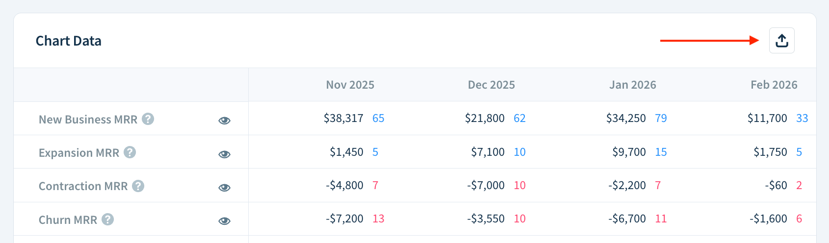
Exporting Chart Data
To export Chart Data as a CSV file:
-
Click the Export as CSV (box with outgoing arrow) button.
- When comparing segments with Show detailed breakdown for each segment selected, choose one of the options:
- EXPORT COMPARISON DATA — includes a comparison of the metric selected in the Compare drop-down
- EXPORT DETAILED SEGMENT DATA — includes a detailed breakdown for each segment
- Name your file and click Save.

To export an activity breakdown as a CSV file:
- Click the Export as CSV (tray with an upward arrow) button in the activity breakdown table.
- Select one of the options:
- Visible columns only — Only includes currently visible columns.
- All data — Includes the whole set of data, including hidden columns.
- Click EXPORT.
ChartMogul emails you a link to a CSV file with the requested data.